Introduction
In the world of quality control and manufacturing, choosing the right control chart is critical for accurate process monitoring. Two of the most widely used tools in Statistical Process Control (SPC) are the X-bar and R charts and the I-MR charts. Understanding the differences between these two chart types helps quality engineers and data analysts make informed decisions based on the nature of their data. In this article, we’ll break down X-bar and R vs I-MR charts in SPC, explain when to use each one, and walk you through real-world examples with step-by-step calculations.
Why We Use Xbar & R Chart:
X-bar & R Chart (Range chart) is used when we collect subgroups (samples) of data from the process.
- X-bar Chart shows how the average (mean) of the subgroups changes over time.
- R Chart (Range) shows the range (difference between the highest and lowest values) within each subgroup.
Why Use X-bar & R Charts?
- To detect shifts in the process average (Xbar).
- To identify increases in variation within subgroups (R).
- To ensure the process stays within statistical control limits.
- Ideal for subgrouped data, typically 2 to 10 samples per subgroup (often 4 or 5).
Real Example: Measuring Shaft Diameters
Suppose we take 5 subgroups, each with 4 shaft diameter measurements (in mm). Here’s the sample data:
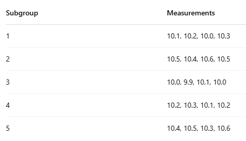
- X̄ (Average) is calculated for each subgroup.
- R (Range) is calculated by subtracting the minimum from the maximum in each group.
Step-by-Step Calculations
Subgroup :
1 :
- X̄₁ (Average) = (10.1 + 10.2 + 10.0 + 10.3) / 4
= 40.6 / 4 = 10.15 - R₁ (Range) = Max – Min = 10.3 – 10.0 = 0.3
2 :
- X̄₂ = (10.5 + 10.4 + 10.6 + 10.5) / 4
= 42.0 / 4 = 10.50 - R₂ = 10.6 – 10.4 = 0.2
3 :
- X̄₃ = (10.0 + 9.9 + 10.1 + 10.0) / 4
= 40.0 / 4 = 10.00 - R₃ = 10.1 – 9.9 = 0.2
4 :
- X̄₄ = (10.2 + 10.3 + 10.1 + 10.2) / 4
= 40.8 / 4 = 10.20 - R₄ = 10.3 – 10.1 = 0.2
5 :
- X̄₅ = (10.4 + 10.5 + 10.3 + 10.6) / 4
= 41.8 / 4 = 10.45 - R₅ = 10.6 – 10.3 = 0.3
Summary Table:
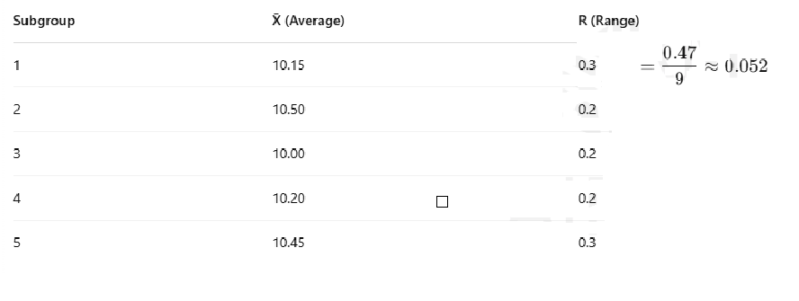
Overall Averages:
- X̄̄ (X-bar bar) = (10.15 + 10.50 + 10.00 + 10.20 + 10.45) / 5 = 10.26
- R̄ (R-bar) = (0.3 + 0.2 + 0.2 + 0.2 + 0.3) / 5 = 0.24
Control Limit Calculations:
(Control constants for n = 4)
- A2 = 0.729
- D3 = 0
- D4 = 2.282
X̄ Chart Limits:
- UCL = X̄̄ + A2 × R̄ = 10.26 + 0.729 × 0.24 = 10.44
- LCL = X̄̄ – A2 × R̄ = 10.26 – 0.729 × 0.24 = 10.08
R Chart Limits:
- UCL = D4 × R̄ = 2.282 × 0.24 = 0.55
- LCL = D3 × R̄ = 0 × 0.24 = 0
Charts
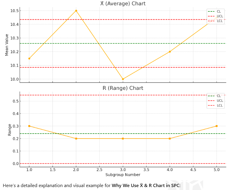
Chart Interpretation:
- X̄ Chart: Helps detect if the process mean is shifting (e.g., tool wear, drift).
- R Chart: Detects if variation is increasing (e.g., due to raw material issues or equipment problems).
In the above charts:
- The green line is the Center Line (CL) – average value.
- The red lines are the Upper and Lower Control Limits (UCL & LCL).
If any point is outside the red lines, or shows a pattern or trend, the process may be out of control and needs investigation.
Using X̄ & R charts regularly helps maintain product quality, reduce waste, and ensure process stability in manufacturing and other industries.
What is an I-MR Chart:
I-MR Chart stands for Individuals and Moving Range Chart. It’s used when you collect only one measurement at a time (no subgroups).
- I Chart (Individuals) shows how each single data point varies over time.
- MR Chart (Moving Range) shows the variation between consecutive data points (e.g., the absolute difference between today’s and yesterday’s values).
When to Use I-MR Chart:
- You can’t or don’t need to group data (subgroup size = 1).
- In destructive testing, where only one item can be tested.
- Low-frequency data collection (e.g., one measurement per hour/day).
- Situations where real-time monitoring is critical.
Example Data:
Let’s say we are measuring the diameter of a shaft in mm from a machine every hour. Here are 10 consecutive measurements:

I-MR Chart Visual (Mockup Description)
I Chart (Individuals)
- X-axis: Time (1 to 10)
- Y-axis: Diameter
- Each point: Actual diameter measurement
- Center Line (CL): Average of all diameters
- Control Limits: Calculated based on standard deviation of the data
MR Chart (Moving Range)
- X-axis: Time (2 to 10) (moving range starts from second point)
- Y-axis: |Difference| between current and previous measurements
- Center Line: Average moving range
- Control Limits: Based on average moving range
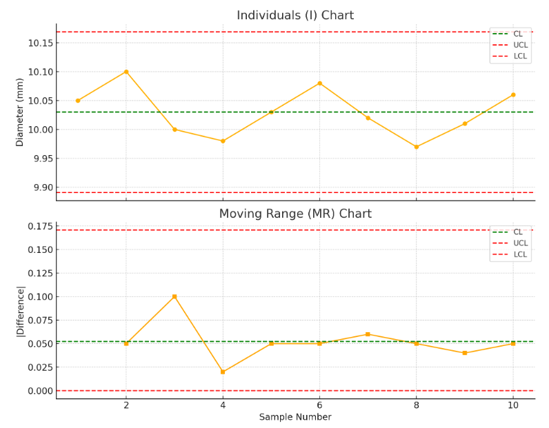
Here is the I-MR Chart based on the sample diameter measurements:
- Top chart (I Chart) shows each individual measurement and its control limits.
- Bottom chart (MR Chart) displays the short-term variation between consecutive measurements.
You can use these charts to monitor process stability and detect any unusual variation. If points fall outside the control limits or show a trend/pattern, it may indicate a problem with the process.
What is the Center Line (CL) in the MR Chart?
The centerline of the MR chart represents the average of all the moving ranges (i.e., the absolute difference between each pair of consecutive measurements).
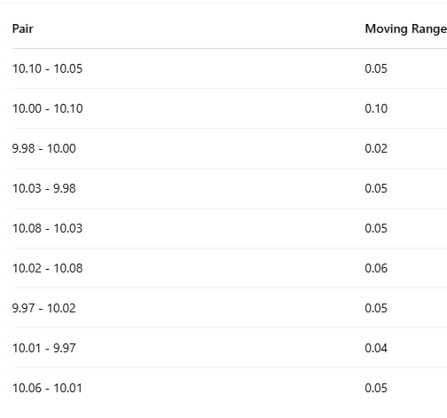
How to Calculate the Moving Range (MR):
Given the measurements:
[10.05, 10.10, 10.00, 9.98, 10.03, 10.08, 10.02, 9.97, 10.01, 10.06]
We calculate the moving ranges like this:
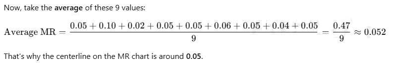
Centerline of MR chart = Average of Moving Ranges
It tells you the typical short-term variation between measurements.
Summary:
| Chart Type | Data Collected | Use For | Tracks |
|---|---|---|---|
| X̄ & R Chart | Subgroups | Process average & variation | Mean & Range |
| I-MR Chart | Individual | Processes with single measurements | Individuals & Variation |
Conclusion:
In conclusion, the X̄ and R chart is a powerful and essential tool in Statistical Process Control (SPC) for monitoring both the average and variation within subgroups, making it ideal when multiple measurements can be collected at the same time. On the other hand, the I-MR (Individuals and Moving Range) chart is best suited for situations where only single observations are available per time point. Together, these charts offer flexible options for tracking process behavior—X̄ & R for subgrouped data, and I-MR for individual measurements—allowing quality professionals to detect shifts, trends, or unusual variation. By applying these SPC tools appropriately, organizations can ensure process stability, maintain consistent product quality, and make informed, data-driven decisions that improve efficiency and reduce defects.
Similar Articles:
Top Interview Questions Related to SPC ,Cp and Cpk
Useful External Links:
- ASQ – Statistical Process Control (SPC)
A comprehensive guide by the American Society for Quality (ASQ) on SPC concepts and tools. - NIST e-Handbook of Statistical Methods – Control Charts
Provided by the National Institute of Standards and Technology, this section dives into control charts and how to use them. - iSixSigma – Introduction to Control Charts
A beginner-friendly overview of various control charts used in Six Sigma and quality control. - Minitab – Types of Control Charts
Official Minitab resource explaining when to use different control charts including X̄ & R and I-MR. - Wikipedia – Control Chart
A general overview of control charts with historical context and chart types.
- X-bar & R vs. I-MR Charts in SPC:

- What is Camber Defect in Steel Manufacturing?

- Top 15 MNCs Every Mechanical Engineer Dreams of Joining in 2025

- How to Digitize and Automate the CAPA Process

- Top 10 Essential Tools Every Mechanical Engineer Should Know

- What is GD&T (Geometric Dimensioning & Tolerancing) ?

- Principles of IATF 16949: A Guide to Quality Management

- The Evolution of IATF 16949: The Automotive Quality Standard


